How to Set Up an AI Safety Monitoring Dashboard with Open-Source Tools
Most monitoring dashboards die quietly. Someone wires up twenty panels, the team looks at them for a week, and then a red number sits unnoticed for a month. The fix is not better charts. It is deciding what you would actually do differently when a number moves, and then building only that.
A safety dashboard for a deployed system has three jobs: surface harmful outputs quickly, notice when the world shifts underneath the model, and keep a record of what went wrong and what you did about it. Everything below serves those three jobs.
Start with the signals that matter
Group what you want to watch into three families, and resist adding a fourth.
- Harm. Rate of flagged outputs from a toxicity or harassment classifier, policy-violation rate, personal data leaking into responses, and successful attempts to talk the system past its own rules.
- Drift. Shift in the input mix — topics, languages, prompt length — plus embedding distribution distance, refusal rate, and average output length. A sudden change in refusal rate is often the first sign that inputs have changed.
- Operations. Error rate, latency, failed tool calls, and cost per request. These are not safety metrics on their own, but a spike here usually precedes a safety incident.
Pick three to five numbers per deployed system. For each one, write down two things: who owns it, and what they will do when it crosses a line. A metric without an owner and an action is decoration.
A lean open-source stack
You can assemble this without a vendor contract. The trick is to pick one tool per layer and ignore the rest until you outgrow it.
- Collection: OpenTelemetry or plain structured JSON logs. Trace-level tools such as Langfuse or Phoenix help when you need to follow a single request through several steps.
- Storage: PostgreSQL handles more than most teams expect. Move to a column store once event volume makes queries slow.
- Computation: Evidently for drift and data-quality reports, Great Expectations for batch validation, Presidio for detecting and redacting personal data in text.
- Visualisation: Grafana for time series and alerting, with a small Streamlit app when you need a custom incident page.
- Versioning: MLflow or an equivalent registry, so a metric shift can be tied to a specific release.
The stack is not the hard part. Keeping it small enough that one person can debug it at 2 a.m. is.
Instrument the pipeline before you build charts
Give every request an ID and log the input, the output, the model version, a coarse user segment, and any safety scores — as one row, not five.
If traffic is heavy, sample the routine records. Do not sample the exceptions: when something is flagged, keep the full detail. Storage is cheap compared with the alternative of knowing something went wrong but not being able to reconstruct it.
Redact on the way in, not on the way out. Hash user identifiers, strip personal data before it reaches the warehouse, and keep raw text in a short-retention store with restricted access. Then backfill: score a historical batch so your first charts have a baseline instead of an empty axis.
Design three views, not thirty
The scorecard
One screen, one row per system, current values against thresholds. This is what an on-call engineer opens first.
The trends
Thirty-day lines per signal with deployment markers drawn as vertical lines. This is the view that turns a vague feeling of "it seems worse lately" into a date and a release.
The incident log
A filterable table of flagged events, each linking to its trace and its review status. If a reviewer cannot find the original text in two clicks, they will stop reviewing.
Add a fourth panel only when someone asks a question the existing three cannot answer.
Thresholds, alerts, and the cost of crying wolf
Set your first thresholds from a week of real traffic rather than from a guess. Note the normal range, then put the alert slightly above it.
Route by severity. A sharp rise in harmful output should page someone. Slow drift belongs in a daily digest. A single mild flag belongs in a queue nobody is woken up for.
Alert fatigue is the most common way these dashboards fail. If a channel receives more than a handful of alerts a day, people start skimming, and the one that matters gets skimmed too. Review the alert history weekly: count how many were real, then tighten or retire the rest.
A runbook, not a fire alarm
An alert with no instructions produces panic or nothing at all. Write five steps and pin them next to the dashboard.
- Confirm. Re-score the sample with a second method, or read a handful of the flagged outputs yourself. False positives are common at first.
- Scope it. How many requests, which version, which user segments, and when did it start?
- Contain it. Roll back, tighten a filter, or disable a tool. A blunt mitigation now beats a precise one tomorrow.
- Record it. What fired, what you checked, what you changed, and who decided.
- Close the loop. Add the case to your test set and revisit the threshold or classifier that missed it.
Step four is the one teams skip and the one that pays off later. It is the raw material for any future review of how the system behaved.
Ship the first panel this week
Choose one system. Pick three signals: one for harm, one for drift, one for operations. Log them with request IDs, drop the rows into PostgreSQL, and point Grafana at them. Set a single threshold, write the five-step runbook, and book a fifteen-minute weekly review. Once that loop is running and someone has acted on it at least once, expand to the next signal.
The dashboard is not the safety system. It is the part that tells you where to look.
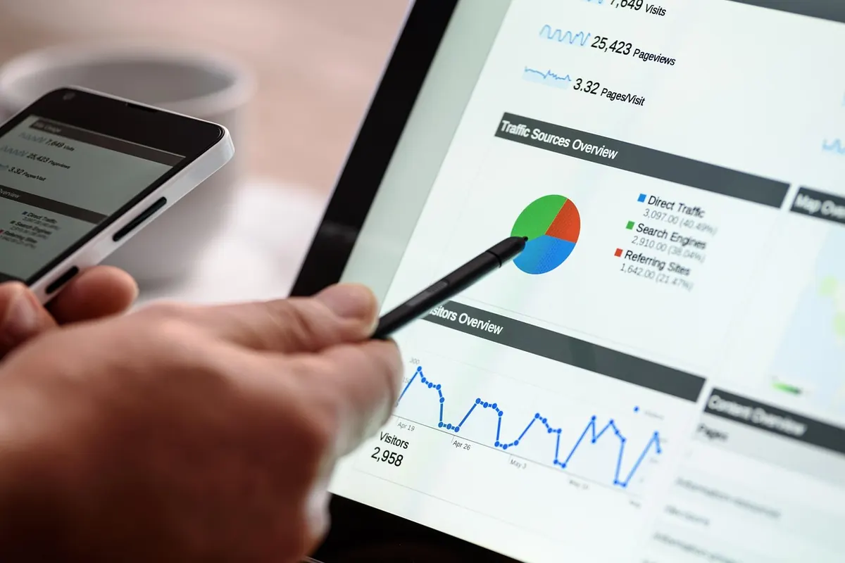
Photo: AS_Photography / Pixabay